 Apple has typically been the leader within the world of user interface design. It embraced the simplistic minimalist-style combined with the glossy look, letter-pressed effect with a splash of grunge. Apple did “design right” and everyone followed.
Everyone Followed, that is, Except for Microsoft
Microsoft marched to its own drumbeat. Apple’s main competitor wanted to differentiate itself and opted for a totally different design-style. Internally, the style was referred to as “Metro” which, according to Wikipedia, is explained as “a better focus on the content of applications, relying more on typography and less on graphics”. If you have a look at Windows 8 or a Windows phone, you can very easily define this style as “flat with reliance on colour and typography and icons.”
Who Designed it First? Google or Microsoft?
In reviewing the styles of any of the Google properties, applications, and Android devices you could argue that perhaps Google set this design trend first. I don’t want to argue who designed it first. The important part that I would like to impress upon you is that for the first time in a long while, Apple did not dictate the design-style of the future. Perhaps it was waiting for the flat-style to dissipate so it could reinvent the look of the web. It appears that Apple gave up on the wait.
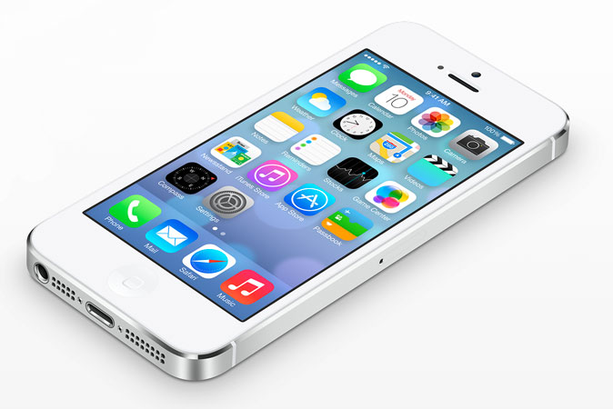
In October, Apple will be releasing iOS 7 for the iPhone, and the screenshots on the Apple site show a very flat Metro-inspired design-style. I am an Apple user. I love its design-style, and I use depth, texture, and gradients in most of my design work. But I find it odd that Apple would surrender to the design-style of its competitor when it led the pack in the past. What I find really interesting is that when you read the section on the Apple site discussing the new iOS7 design, it really sounds like Apple came up with this style first.
Nothing we’ve ever created has been designed just to look beautiful. That’s approaching the opportunity from the wrong end. Instead, as we reconsidered iOS, our purpose was to create an experience that was simpler, more useful and more enjoyable — while building on the things people love about iOS. Ultimately, redesigning the way it works led us to redesign the way it looks. Because good design is design that’s in service of the experience.
But does it all really matter?
Deep down, does any of this really matter? As a designer I know that the future design trends will impact the way I go about designing websites; as a matter of fact, it already has. I have seen a shift from the use of grunge to a more flat, simple design. At the end of the day, these design choices do not make much of an impact to most businesses that have a website.
When a user leaves your website, would you prefer that his thought is “Wow, that was a really well designed website!” Or would you prefer “Wow, I was able to find exactly the right information which allowed me to make a purchasing decision!” While there is always a place for a visually appealing website, we cannot overlook the need for usability. As a designer, I cannot just attempt to make an attractive website. A website needs to have the information at hand that the visitor is looking for. I could make the most beautiful website in the world, but if it didn’t lead to more sales or leads, then I have not done my job. At bWEST, we look at the analytics when we start building or redesigning a new website for a client. How are people using the website? What are they looking for? How can we get customers to make a purchase in the least amount of clicks? If these items are not considered, then an attractive website is just that- an attractive website, not a sales tool.
If you read the quote from Apple again, you will notice a very important line: “Ultimately, redesigning the way it works led us to redesign the way it looks. Because good design is design that’s in service of the experience.” This is where Apple shines. It put a major importance on the design side of things, but put a bigger focus on the user experience. I try to live by this rule, and any good designer will keep this at heart when redesigning a website.
Your website is like a Bonsai Tree
A bonsai tree is continually manicured, pruned and shaped so that it will always be impeccable. Let it grow on its own and it no longer looks beautiful, but instead becomes simply a small, bushy tree. Your website must be treated the same way. You must examine your website’s analytics to see how people are using your website and what information are they looking for. Most importantly, you must react to this information to increase goal conversions.
I advocate an annual checkup for any website. The internet and the way people use it changes often. By reviewing your website statistics frequently, you will ensure to maximize your potential revenue and exposure to your product/brand/service. While a design update is nice to have, if you had to make a choice between design and usability, you should always choose usability.
When was the last time you reviewed your website? Are you aware of how much revenue it is generating (or losing) for your business? If you have not done a thorough review of your website in the last twelve months, then you must read about how we helped Liberty Jane Patterns increase their revenue over $8,000 with just a few small changes. Then it’s time to get in touch with bWEST.