 With the rise of smart-phones and tablets (now used more often to access the web than computers), there was once upon a time the need to build mobile websites. Those websites were scaled-down versions of whole websites specifically designed for mobile devices.
However, this approach to mobile browsing had a problem: important content needed to be duplicated across platforms, posted both to the full and the mobile versions. But in the last few years, a new type of web design approach has made its way to the mainstream: responsive design.
What’s behind responsive design?
Responsive design is a web development approach that sees a website as a series of modules of content that can be rearranged depending on the device that accesses it. Instead of having two separate platforms, the company with a responsive website only manages a single one.
How does it work? Simple. When the website detects a mobile device, it rearranges its layout to adjust to the screen size. Some sections of the website’s content may be hidden or moved. The most important information remains on the screen, while what’s less necessary for the mobile user is moved aside.
This approach is adaptive and agile. It considers the needs of the user based on the device used rather than impose a layout from the mobile version. This enables content creators and managers to do their job unimpeded by concerns for “mobile” and “desktop” content.
Why does responsive design help us?
Responsive design makes the content creator’s job much easier because it removes the mobile factor. We can now focus on producing excellent content for all audiences, and let the website do the job of making it look good on all devices.
It also enables us to share content without regard for potential issues with mobile websites. We often see potential customers complain that links shared on Twitter aren’t accessible on their smartphone; with responsive design, the website makes the content available for every user, not just those who use computer screens.
But the best thing of all: no more duplication. The content is posted once, and the CMS does the rest. This has already saved hours of work for content producers, and will hopefully save hours more in the future.
If your company or organization has yet to adopt a responsive approach to its website design, now is the time to make your argument for it. Not only does it make for a seamless browsing experience, but it also saves content producers precious time (and the company money) to do what they do best: write content, post pictures or make videos. And now, all this amazing content will be available for every user, no matter his or her device of choice.
Every website bWEST designs and develops is responsive. Here are a few recent examples:
- Reboot Communications
- Marina Restaurant
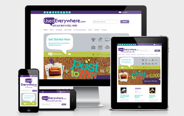
- UsedEverywhere
- Cheques and Balances Bookkeeping
- Social Media Camp
- Victoria Wellness Professionals
- SeaCider Farm and Ciderhouse
You can contact us here if you would like to get an estimate on developing a responsive version of your website.